Vital Bite Wellness Co.
A modern wellness blog focused on bite-sized inspiration for a healthier, balanced life. The original branding and social media strategy were designed to reflect clarity, calm, and consistency – building a fresh digital presence that engages and uplifts.

The Ask
To create a vibrant and cohesive brand identity for Vital Bite Wellness Co., a wellness and health blog that inspires people to live healthier lives without sacrificing joy or personality. The brand needs to stand out in the crowded health and wellness space by embracing fun, flavor, and balance, not restriction.
The Approach
Brand Positioning
Positioned as a wellness guide for the modern lifestyle, Vital Bite breaks away from restrictive health norms by offering colorful, exciting, and realistic ways to stay healthy while enjoying life.
Visual Identity
-
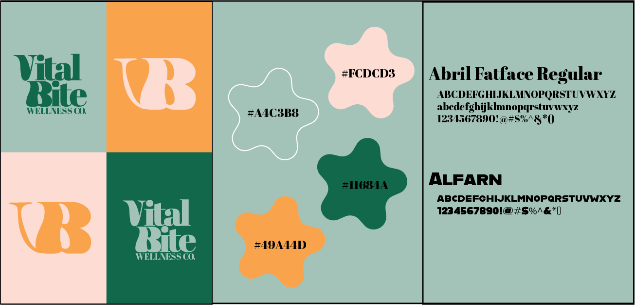
Logo Suite: A dynamic pairing of full name and monogram (“VB”) for flexible brand applications.
-
Typography: Bold and elegant typefaces—Abril Fatface for editorial flair and Alfarn for modern strength.
-
Color Palette: A fresh mix of soothing greens and energetic peach/mustard tones, reflecting both vitality and warmth.
Target Audience Focus
-
Young adults and millennials who value health but reject boring, one-size-fits-all wellness routines.
-
Socially engaged individuals who appreciate aesthetics, balance, and authenticity.
Content Strategy
-
Branded visuals support blog content, recipes, social media, and wellness guides.
-
The visual identity enhances shareability and user trust while reinforcing a message of joyful wellness.
Brand Tone and Personality
-
Uplifting, non-preachy, empowering, and stylish.
-
Speaks to readers like a wellness-savvy friend who enjoys green smoothies and brunch cocktails.


